Skyler Liu
Pitch-Ready Styleframes (5 frames)
2026
In this project, I created a set of FIVE (5) fully polished style frames designed to be presented as part of a professional pitch for a motion design project. These frames should feel ready to show a client, creative director, or studio.
Softwares
Procreate
Photoshop


01
Research
Coinbase is more than just a crypto platform; it’s a brand that’s successfully rebranded the complex world of finance into something approachable and even fun. Their identity is built on a "tech-forward" aesthetic—clean, bold, and incredibly polished. They use a friendly, often humorous tone to invite everyone to participate in the new digital economy, centered around their core mission:
“Update the System.”

02
Moodboard
My project explores this "update" through a playful yet hard-edged visual narrative. I’ve chosen the iconic Pac-Man as the central metaphor. In these frames, the act of "eating" is a literal interpretation of updating: it’s about clearing out the old, stagnant data to make room for a vibrant new digital reality.
By mixing retro pixel elements with organized technical graphics, I want to capture that specific Coinbase energy—the intersection of a simple, gamified user experience and the complex, high-speed infrastructure running behind the scenes.


03
Sketch


First pass
In the first draft, I used a top-down composition for Frame 1; however, I found that this perspective made lighting difficult to handle and did not align well with the flatter compositions of the other two frames. As a result, in the second draft, I revised Frame 1 to a more level, frontal composition.

Second pass
04
Iteration

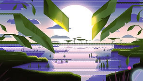
Initially, I aimed to create a misty atmosphere, with the light source appearing faint and partially obscured.

In the second version, in order to better align with the following two styleframes, the sunlight was made more visible and positioned closer to the horizon.

Initially, the color scheme leaned toward green tones, which felt more closely connected to nature.

Later, I revised it to a blue-dominant palette after realizing that Styleframe 1 primarily used orange and blue. This adjustment helped maintain greater color harmony across the set.