Skyler Liu
2027 the Rookies
Awards Package
2025
In this project, I collaborated with Ian Wicenski to develop the opening package for the 2027 Rookies Awards. We focused on crafting a visually engaging and cinematic experience that would captivate audiences both online and in person. Our goal was to introduce a refined yet contemporary atmosphere to the event.
Softwares
Music Source
After Effects
Photoshop
Cinema 4D

01
Research
The Rookies is a global awards program recognizing outstanding emerging talent in animation, visual effects, game development, and digital design. It highlights exceptional student work, provides industry exposure, and helps young creators take their first steps into professional careers by celebrating creativity, skill, and innovation.
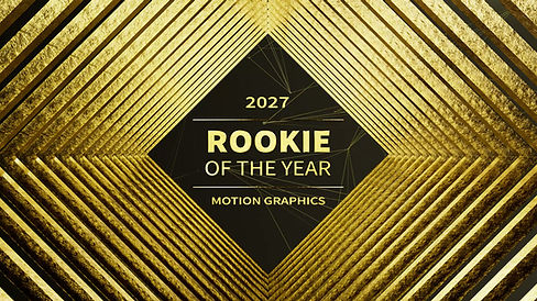
After studying the style guide published on their official website, we found that the core elements of their visual identity revolve around a black-and-gold color scheme. The gold is presented as a gradient transitioning from dark to light. We will incorporate both of these characteristics into our design in order to maintain continuity with their brand style.


02
Concepts & Storyboard
Plan A-Perspective Sculpture
The core of this idea lies in deconstructing the logo itself. We noticed that the Rookies “R” is composed of eight irregular geometric pieces, which became the foundation of our concept. We explored whether these eight elements could be separated so they appear like scattered components from a side view, yet align perfectly into the full “R” when seen from a specific angle.


Plan B-Lighting Logo
This idea was inspired by classic logo-reveal techniques that use shifting light to unveil the emblem. Openings like those of Universal Studios and 20th Century Fox begin in darkness, allowing the logo’s silhouette to emerge before gradually revealing its full form. This transition from shadow to light creates a sense of scale and suspense, effectively capturing the viewer’s attention.


03
Styleframes
Between the two concepts, we ultimately selected the perspective sculpture. It stood out because it offered a more innovative and engaging approach.


For Lightning Logo


04
Opening Animation

In the first pass, we attempted to push the concept further by fully deconstructing the logo. However, the feedback indicated that this approach made the elements feel too fragmented and caused the design to lose the core essence of the perspective sculpture.

In the second pass, we retained the original structural components of the logo and adopted ensemble story archetype. We first revealed a small portion of the puzzle-like pieces, then expanded to show a larger assembled section, and finally presented the full transformation into the complete logo.
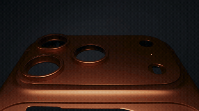
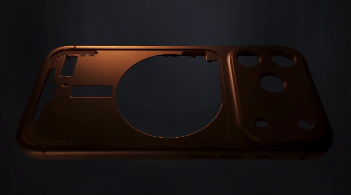
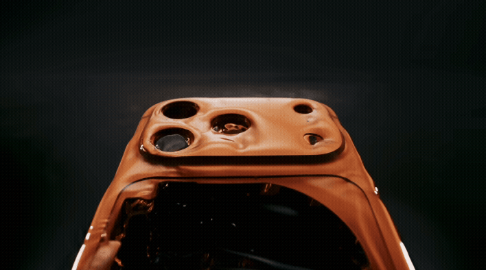
We conducted extensive research on camera movement. After a period of exploration, we focused on Apple’s promotional videos as our primary reference. Apple’s brand aesthetic has always been sophisticated and minimal, and we hoped to learn from their highly refined motion design. The iPhone 17 promotion continues this signature visual language. From these clips, we identified three key principles: the camera must remain stable and move slowly, the product should move at a pace similar to the camera, and the lighting must stay dynamic throughout.
Apple Promotion Animation

In the third pass, we further refined the editing approach and adjusted the material qualities. We also shifted the background lighting from a cool tone to a warmer one, which better complemented the overall visual direction.

In the fourth pass, we made more detailed adjustments. These included adding more puzzle pieces in the second shot, adding star shining effect in the final shot and changing the camera movement path. We also adjusted the appearance of the logo by adding a bevel to make it more shiny.


Visualization of the opening animation as applied on stage. The stage background was generated by ChatGPT.
05
Lower Third
[Made by Ian Wicenski]

When designing the first version of the lower third, we referenced the grid background elements from the official style guide, keeping it consistent with the established visual language.

For the final pass, we incorporated more of our own concepts. We introduced numerous puzzle-piece elements into the design, echoing the idea of a perspective sculpture.
06
Transition Animation
When designing the transition animation, we made sure to preserve the square, right-angled shape language, and added a mesh-like pattern in the background to enhance the sense of dynamic.

Motion Test
Final Pass
07
Problem Solving
In this project, we encountered the following challenges:
1.Audio and visuals out of sync
In our first version, the audio had not been processed; we simply extracted a complete segment from the original track. Later, however, we discovered a small issue: there was a one-and-a-half-second mismatch between the music and the visuals. In other words, the musical transition occurred 1.5 seconds later than the corresponding change in the picture.

Following a suggestion from the art director, we found an elegant solution. We isolated a highly repetitive drum section from the track and used it to extend the music. This allowed us to realign the audio with the visuals while keeping the overall sound natural and unobtrusive.

2.Texture mapping error
At the beginning, there was a minor issue with the logo’s texture mapping, which caused the sides of the logo to look quite strange. After troubleshooting, we discovered that the bevel deformer was the source of the problem. However, we could not simply discard the bevel effect. In the end, we merged the bevel effect with the model (combine & delete), and the texture immediately returned to normal.


08
Final Deliverables


